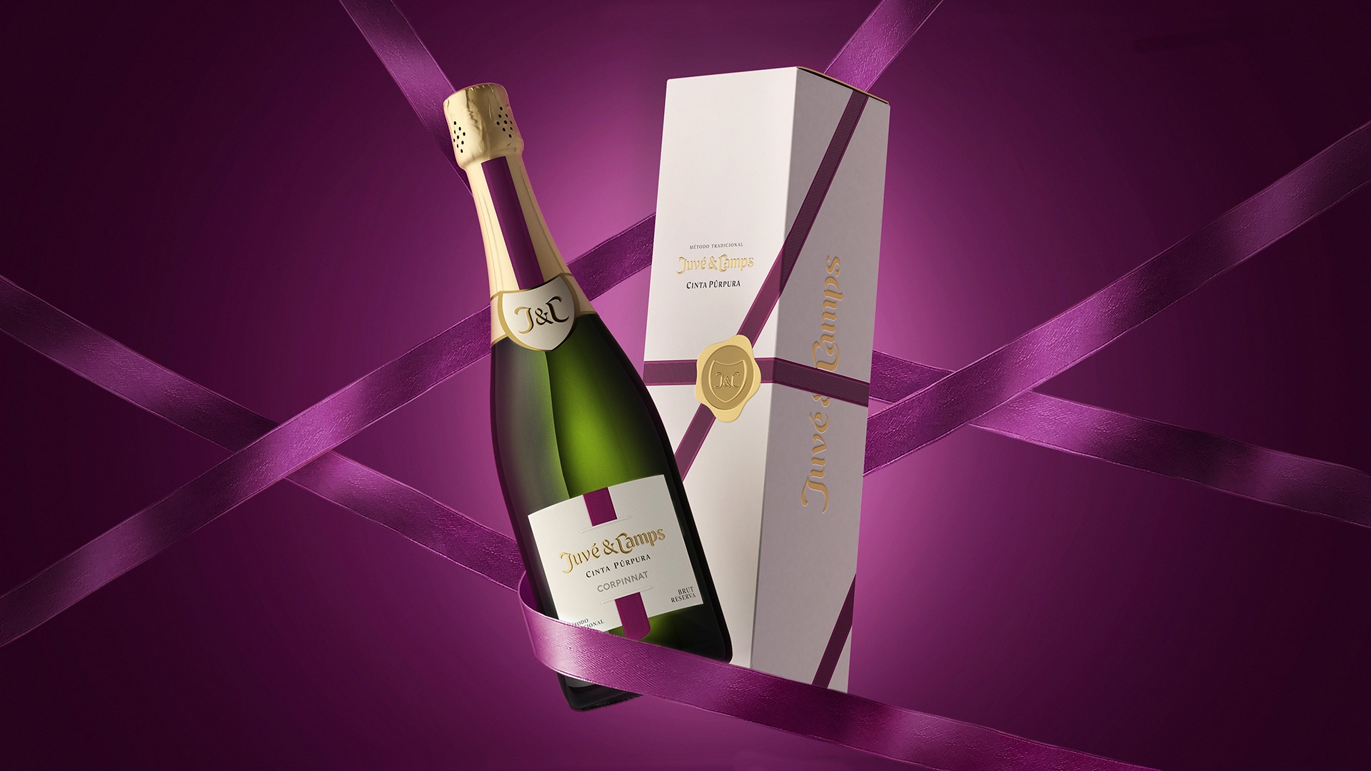
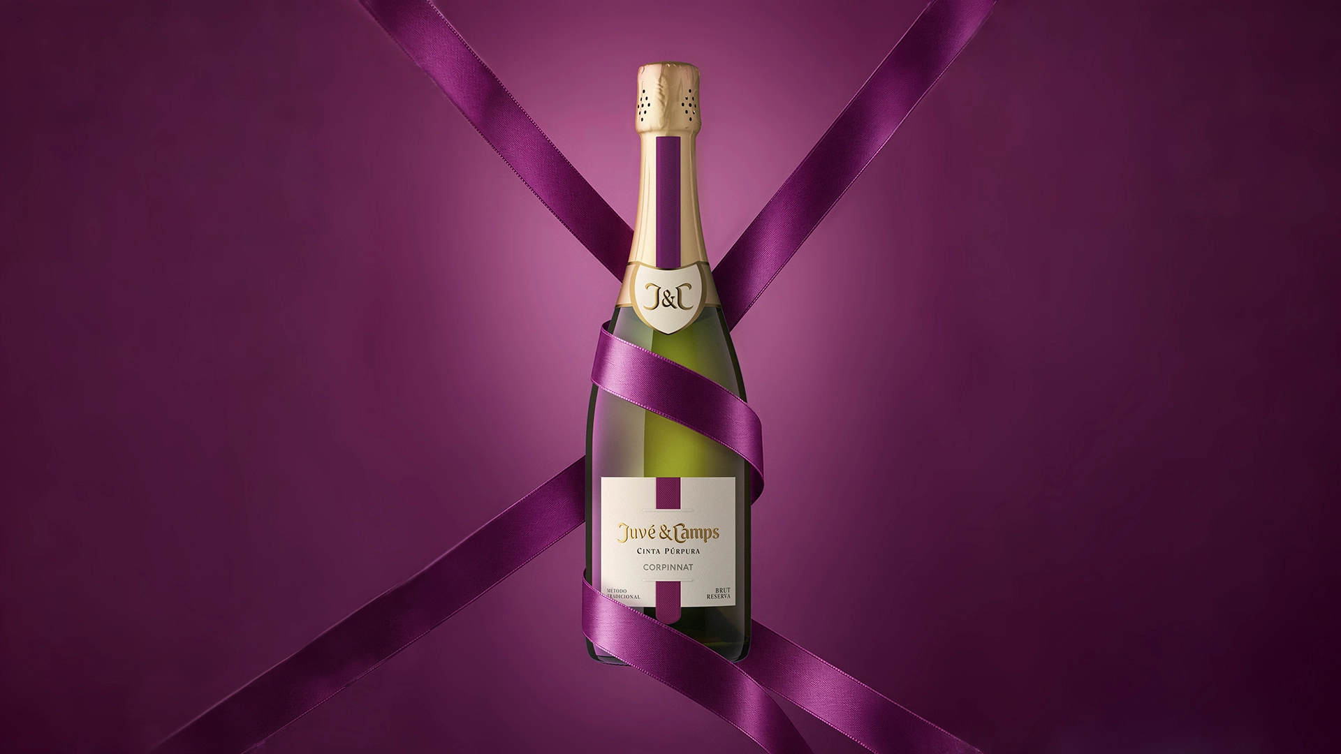
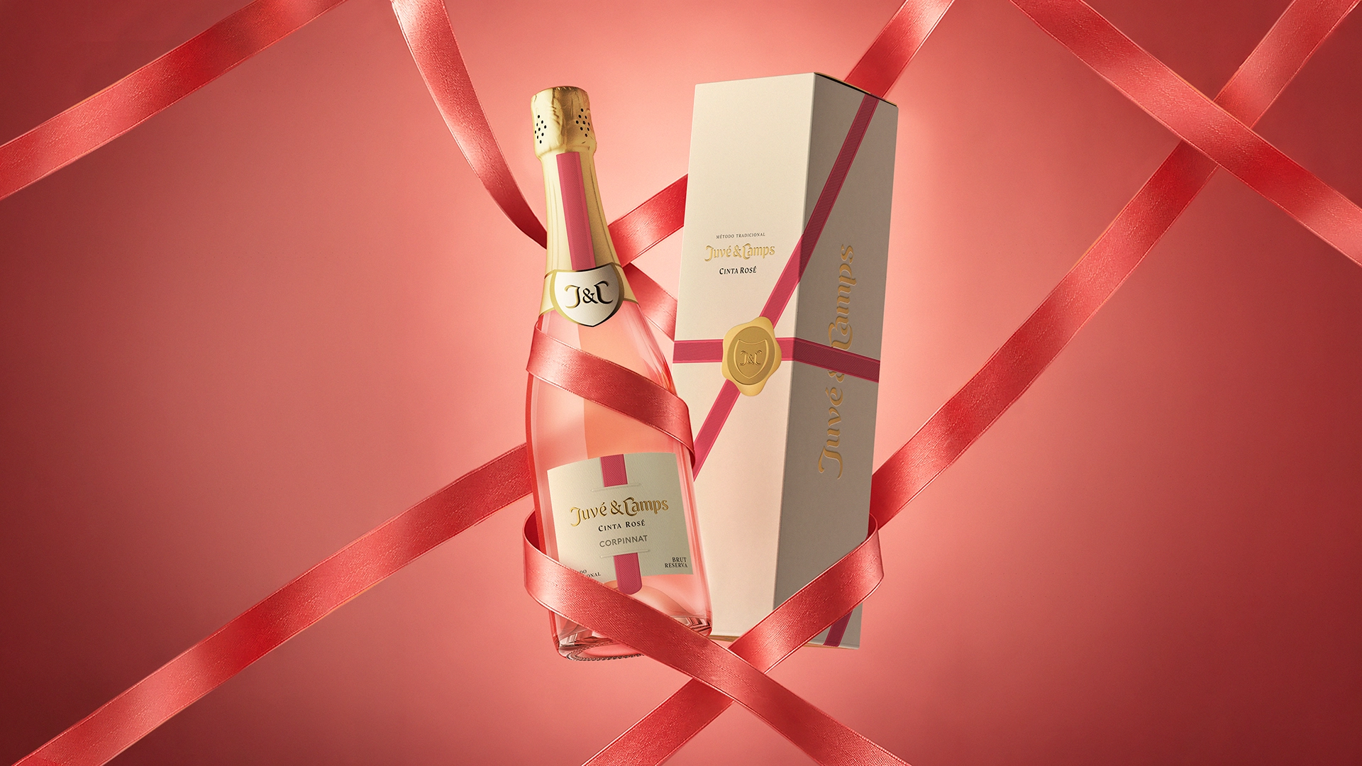
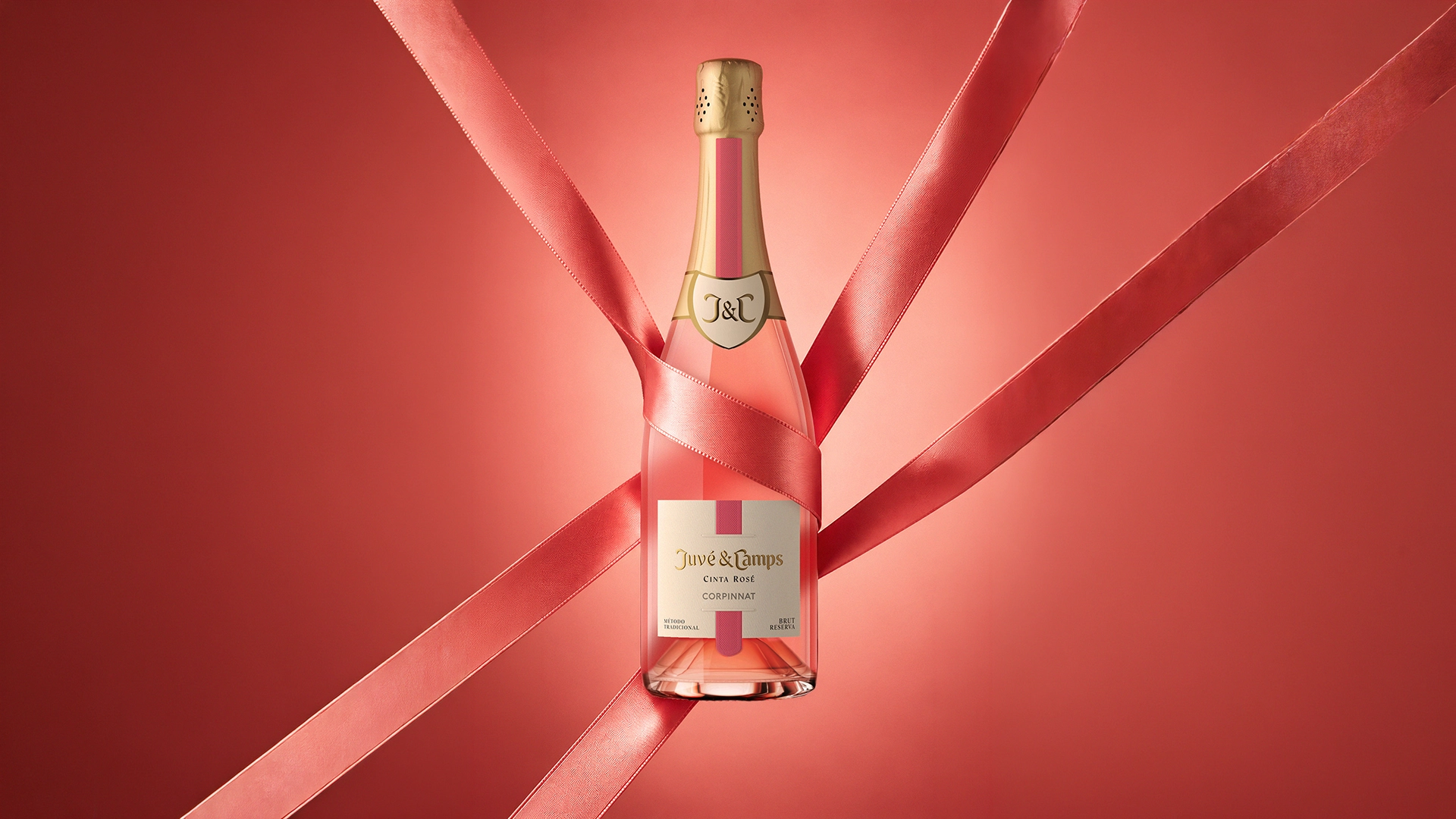
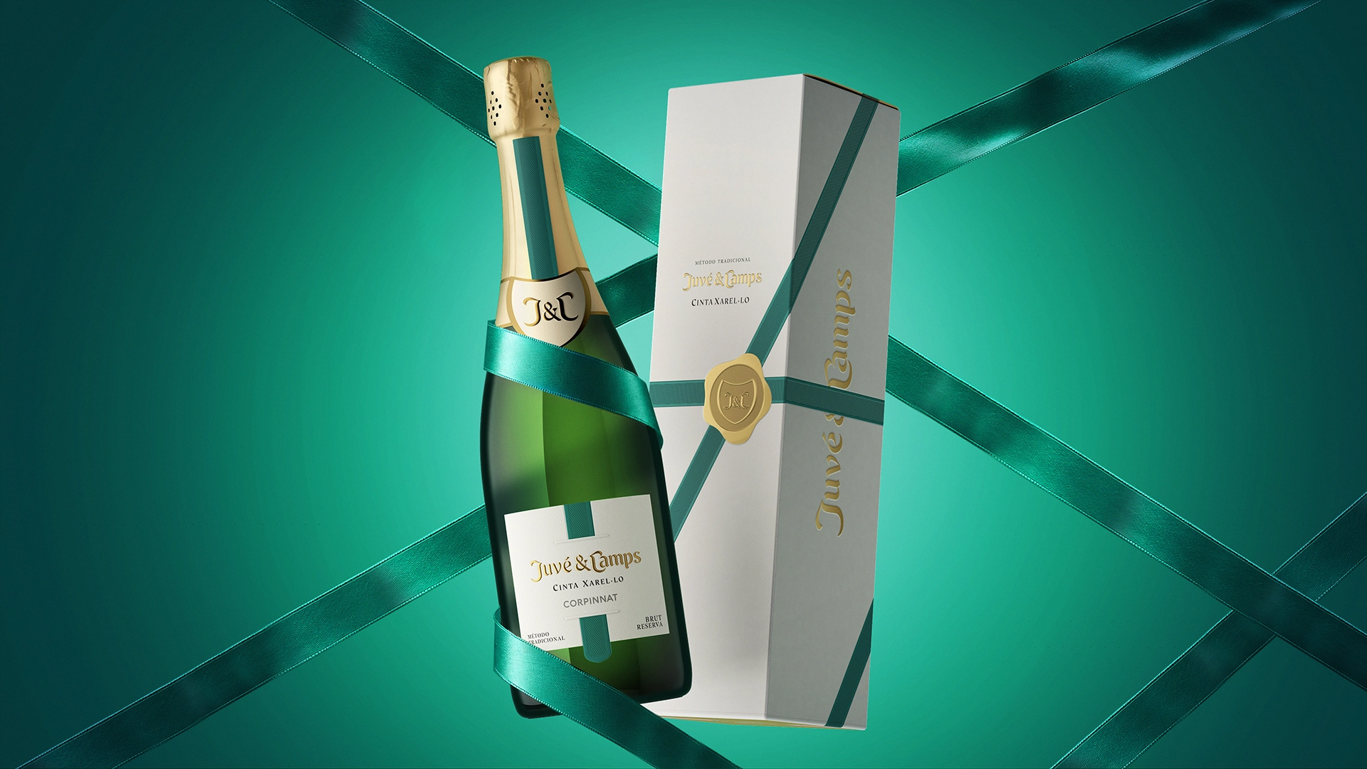
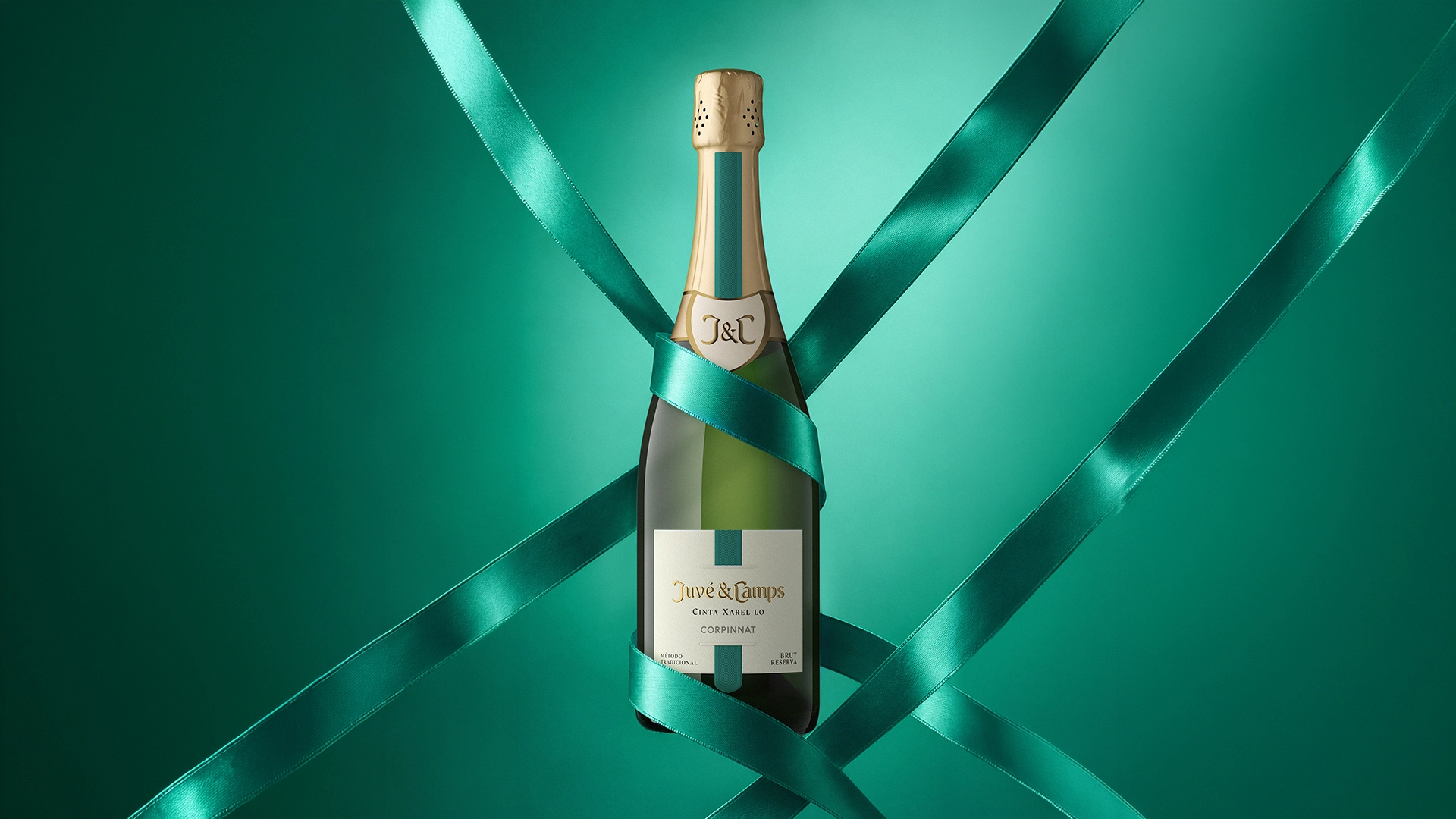
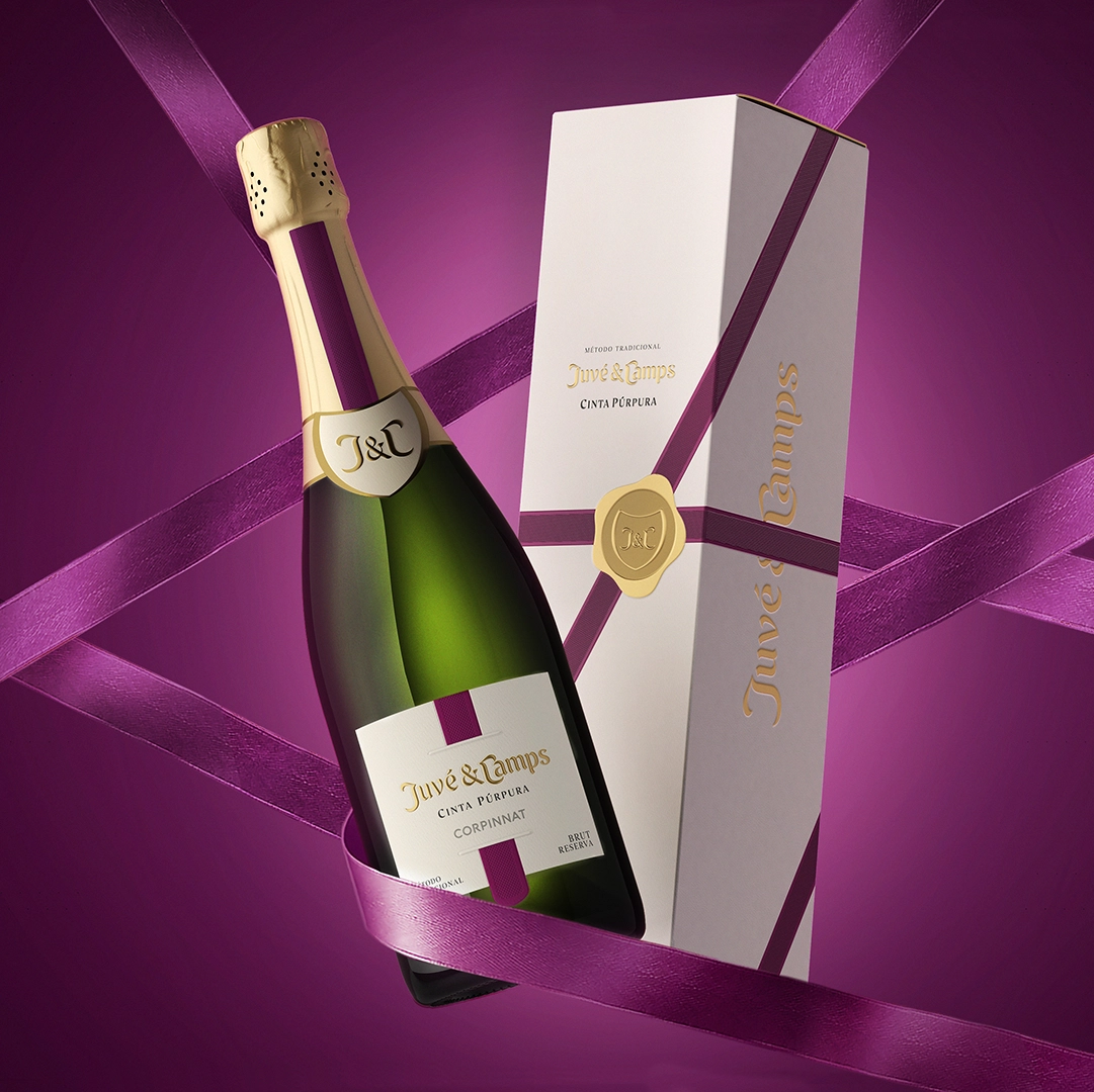
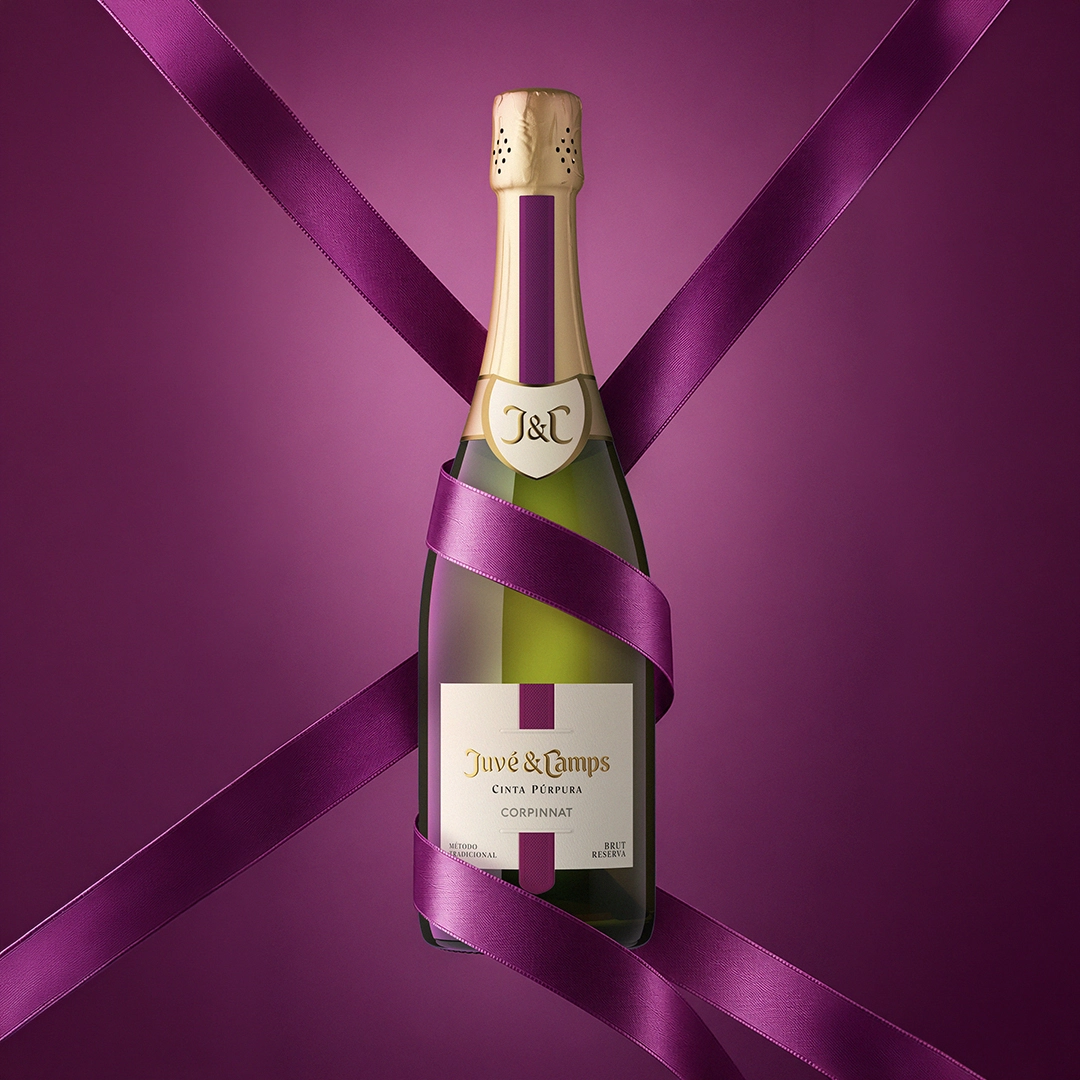
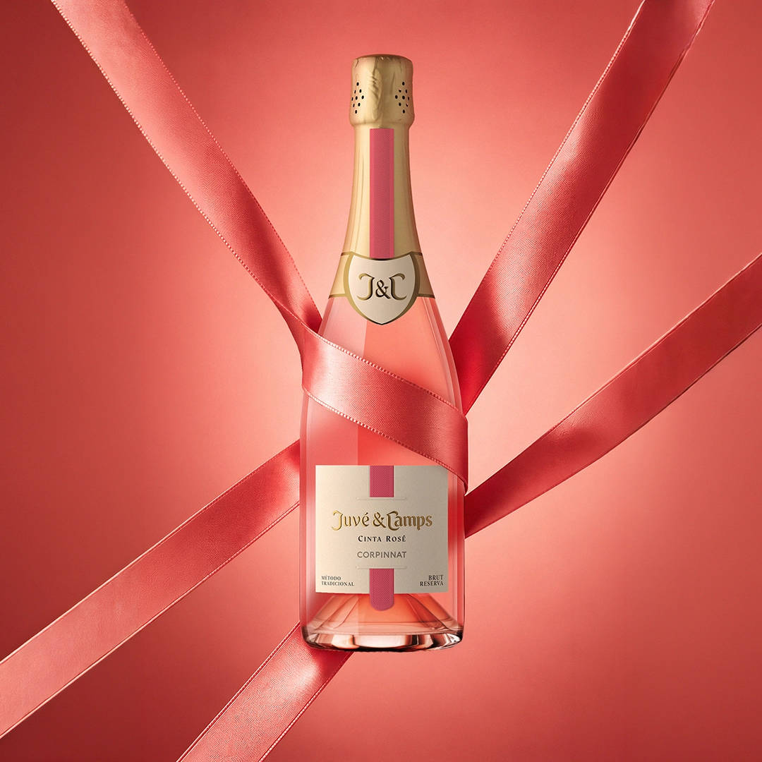
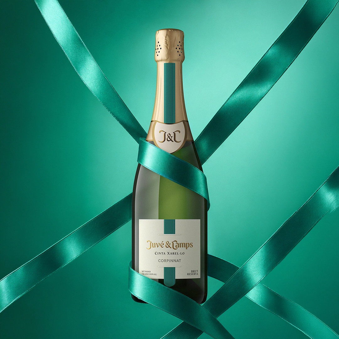
Juvé & Camps Cinta marks a new chapter for its Essential collection, reclaiming not only its original name, but also one of its most distinctive codes: the ribbon.
Originally, a ribbon was placed by hand around each bottle, becoming a distinctive hallmark of the collection. Over time, as the range evolved into Essential, this element disappeared, and with it, part of the connection to its heritage was lost.
The new identity brings the ribbon back to the forefront, reinterpreted through a contemporary, elegant and sophisticated lens. Not as an exercise in nostalgia, but as a distinctive brand code capable of connecting past and present.
The design takes the concept one step further through a trompe-l’œil effect. The ribbon is printed across different elements of the bottle —the capsule and the label— carefully aligning its path to create the illusion of a single ribbon running vertically down the bottle. A graphic solution that makes visually possible what is not industrially feasible.
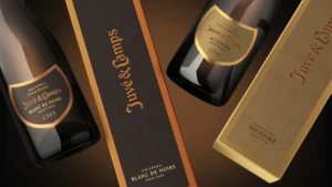
The ribbon also extends to the presentation box and across the wider identity, becoming the unifying thread of the entire collection and restoring a distinctive, recognisable visual code deeply rooted in its origins.